Evidexa brand strategy and design.
From research concept to human-first platform: Building a brand foundation for a healthcare startup
The Situation
Evidexa is an early-stage healthcare startup pioneering a new platform of behavioral simulation. The founders brought deep domain expertise and a compelling vision for disrupting healthcare innovation. What they didn't yet have was a brand that could carry that vision across the board for investors, partners, and enterprise clients.
The Challenge
The company's early materials were dense, technical, and research-oriented. The feedback from the market was consistent: interesting idea, but the story isn't clear. The problem wasn't with the concepts or the science, it was that the brand took a backseat to the methodology. There was one clear signal buried in all of it, though: the founders were deeply committed to a human-first approach. That belief would become the foundation for everything.
My Approach
I came to this project through an existing relationship with the founding team, and worked as the sole strategist and designer across the entire engagement.
My process started with a series of workshops and working sessions with the founders to hear firsthand their ideas to understand where we needed to shift the narrative. The turning point came when we stopped talking about the technology and started talking about the patient. Once we anchored the brand in human impact rather than technical capability, everything became clearer: the story, the voice, the visuals.
From there I developed:
Positioning: reframing Evidexa from a research concept to a decision-making platform with humanity at its core
Tone of voice: moving away from abstract modeling language toward the real people the platform serves: patients, members, clinicians
Visual identity: a cohesive system that balances scientific credibility with human warmth
The Work
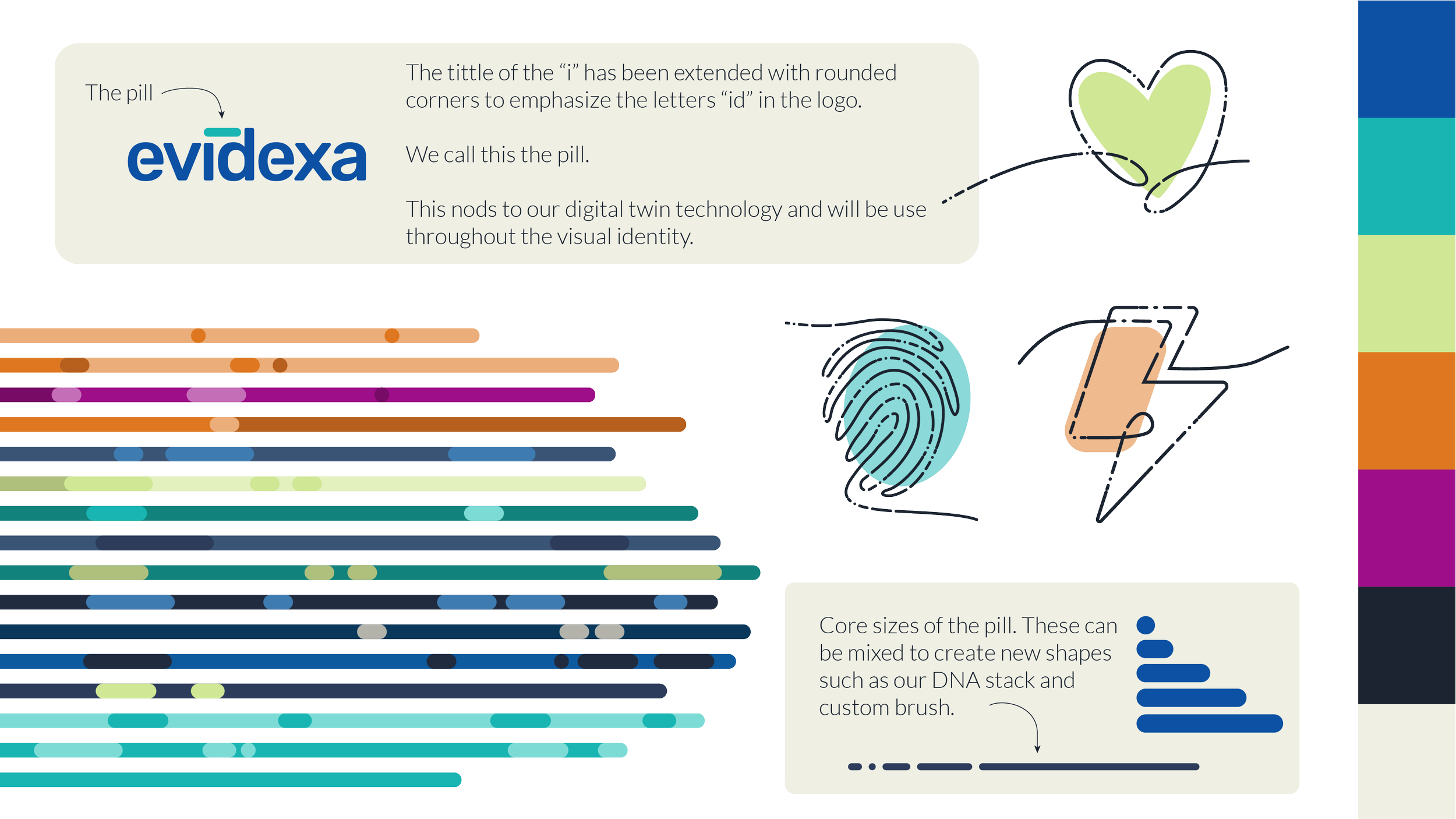
The visual system started with the logo. I updated it to incorporate rounded edges softening the mark to reflect the human-first positioning and drew out the "ID" letterforms as a deliberate nod to the digital twin technology at the heart of the platform. That "ID" element became a foundational graphic device across the entire system, giving it both conceptual depth and visual flexibility.
The full deliverable included brand positioning, an extensive tone of voice guide, logo evolution, and a complete visual system all documented in brand guidelines ready for use across investor decks, product, and marketing.
Full guidelines available upon request.
The Outcome
The brand is live and in active use. In the founder's words, it gave the team "a good unifying set of assets that moved us forward" helping them solidify how they present Evidexa to investors and clients alike.
Scope: Brand strategy, tone of voice, visual identity, brand guidelines
My role: Solo strategy and design
Sector: Healthcare / B2B SaaS