Internet Society + Internet Society Foundation
Brand architecture strategy: merging two organizations into one coherent system
The Situation
The Internet Society and the Internet Society Foundation had grown strategically over the years into two distinct but closely related organizations. To the outside world, however, the distinction was nearly invisible. Despite communications efforts, staff continued to operate from an inside-out perspective. They were deeply familiar with the internal differences between the two organizations, but unable to see what external audiences actually perceived: two organizations that looked and felt essentially the same, without a clear reason for both to exist separately.
Leadership recognized the problem and made the decision to explore merging the two brands. I was asked to research, develop, and present a strategy for how that merge could work.
The Challenge
This was a brand architecture problem with real complexity underneath it.
The two organizations had different audiences, different operational models, and different roles. Simply collapsing them visually risked undermining what made each distinct. But leaving them as-is was no longer reliable. The challenge was finding an architecture that resolved the external perception problem while preserving the strategic integrity of both organizations all while giving them room to grow.
There was also a structural complication: over the years, the ISOC logo had been extended to create a sub-brand system for internal departments. Any architecture decision for the Foundation would have implications for that existing system too.
My Approach
I drove all of the research, strategic development, and proposal work independently. I began by evaluating the four primary brand architecture models against the specific needs of both organizations:
House of brands: what ISOC and the Foundation effectively were: two separate brand identities operating independently. This was the problem, not the solution.
Endorsed brand: quickly ruled out. The endorsement model implies a parent-child hierarchy that didn't accurately reflect the relationship between the two organizations.
Sub-brands: a strong candidate initially, given the existing ISOC logo extension system. But placing the Foundation into that architecture would have positioned it alongside internal departments significantly devaluing what the Foundation actually does and represents.
Branded house: the recommended direction. Used by organizations like FedEx, this model unifies entities under a shared visual and strategic system while allowing each to retain its own presence. Crucially for ISOC and the Foundation, it also provides room for future growth if either organization expands.
The branded house approach was right, but required a nuanced application. Unlike FedEx with its many subsidiaries, ISOC only has two entities so the implementation needed to feel considered and deliberate rather than a heavy-handed corporate system.
To get to consensus, I grounded the entire proposal in organizational need rather than aesthetic preference. Logos and color evoke emotion and personal opinion; I deliberately framed every recommendation around what the market required and what the strategic evidence supported. The concept of a merge had already been approved by leadership and my work was to provide the rigorous rationale and a clear path forward.
The Work
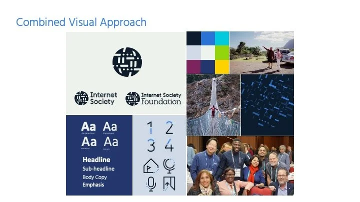
Brand architecture recommendation: A hybrid branded house approach unifying both organizations under a shared visual and strategic system, with each retaining a distinct but clearly related identity. The architecture was designed to resolve the external perception problem while giving both ISOC and the Foundation the space to operate and grow independently.
Visual merge strategy: Rather than designing from scratch, I went back to the core visual elements that had driven the development of each brand:
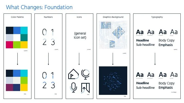
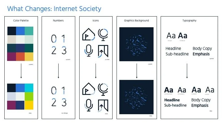
For ISOC: the node: the prominent geometric shape at the heart of its visual library
For the Foundation: the dots and dashes: the "seeds" embedded in its logo
From those two foundational elements, I developed a merged graphic language to be shared across both organizations:
ElementApproach:
Typography: Unified across both orgs, same typefaces and hierarchy
Color: Combined palette retaining the Foundation's brighter colors alongside ISOC's grounding tones
Photography: ISOC's photo strategy extended to the Foundation
Illustration: Nodes and dots combined into a shared illustrative system
Numbers: ISOC's node-based numerals carried forward
Icons: Updated to incorporate the dot pattern
Background patterns: New combined pattern merging both systems; Foundation's trace line pattern retired but its elements integrated
Brand symbol: Nodes and dots merged into a single shared symbol representing both organizations
This approach used ISOC as the structural base while meaningfully integrating the Foundation's visual DNA so both organizations are genuinely represented in the outcome, not just one absorbing the other.
Two new logos The proposal included adapted logo concepts for both ISOC and the Foundation, reflecting the merged system while maintaining each organization's distinct identity within it.
Leadership presentation The full strategy, architecture rationale, and visual direction were presented to leadership and approved in principle.
The Outcome
The proposal was approved in principle by leadership. My position was eliminated at the end of 2025 before implementation could begin, and the work remains unimplemented at this time.
The value of this project is in the strategic process: a rigorous, research-backed framework for solving a real organizational perception problem, developed independently, grounded in brand architecture best practices, and built to withstand scrutiny beyond personal preference or aesthetic opinion.
Scope: Brand architecture strategy, visual merge system, logo concepts, leadership presentation
My role: Solo: research, strategy, visual direction, and visual design
Organization type: Global nonprofit (two related entities)
Status: Approved in principle; implementation pending
Excerpts from the Strategy Presentation